Let’s pick a logo for the team #9
Replies: 11 comments
-
|
My initial reaction is the far right pixelated heart icon (the one without the sparkles and more open space). Definitely curious what others think/prefer, would be great to do any iteration at Contributor Day and try to get this finalized and shipped today / before the end of the week. |
Beta Was this translation helpful? Give feedback.
-
|
I like the centred fingerprint shows the human with ai touch! |
Beta Was this translation helpful? Give feedback.
-
Personally I'm not reading that in these logos. I don't think ✨ conveys "AI", fingerprint to me say auth, and the heart/monitor read to me more as health/monitoring (e.g. Site Health) I like the "Building Block" in that it signals our approach and the different efforts, but considering we already have Gutenberg "Blocks" I don't think that's enough.... This might be a bit too on the nose/cliche, but what about a cross between a building block (representing the team and approach) and a 🤖?. I am not artistic in the slightest, but this is the nightmare fuel that I was able to get out of gemini as an example: 
(alternatively just ignore me and carry on. there's a reason I don't do design😅) |
Beta Was this translation helpful? Give feedback.
-
|
My preference is the middle one, here!
I agree with @justlevine that the fingerprint is too often associated with security these days. I like the block with sparkles as the way we're building AI is "pluggable" with the AI magic. ✨ |

Beta Was this translation helpful? Give feedback.
-
|
My preference is the heart with the sparkles in the middle on top, or the brick in the middle. |
Beta Was this translation helpful? Give feedback.
-
|
I vote for Block with sparkles |
Beta Was this translation helpful? Give feedback.
-
|
I vote for the last one - thumb print with sparkles representing both human and ai aspect well plus will do well in all sizes |
Beta Was this translation helpful? Give feedback.
-
|
I can't settle on one - but the building block series is where I'm leaning. |
Beta Was this translation helpful? Give feedback.
-
|
I love the finger print ✨ |
Beta Was this translation helpful? Give feedback.
-
|
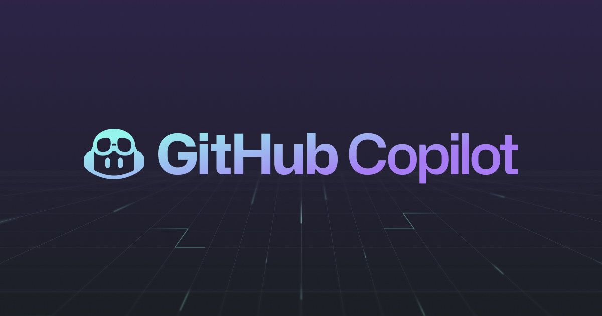
I think we're asking too much to have it represent human + AI in a literal sense; I think approachable + AI should be the goal here. I agree that the thumbprint has a privacy/auth connotation and both the EKG and heart are too health related. The block icons feels maybe a little too developer focused but I like those the best so far. Given the ambitions of the project (WP Admin omnipresence, agentic capabilities, etc), I’d love to see the logo be more focused on the consumer audience rather than the developer audience, something more like an assistant avatar. Github Copilot is a great example. For that reason, I like what David proposed. Iterating on that concept, here is something with a little more exaggerated features (but perhaps a touch too cutesy). 
Maybe call the assistant "Cory" (because it's the Core-adjacent AI plugin, it's Core-y … ). If it’s a good enough for now situation, I’d go with the sparkle-block but use the solid sparkle rather than the outline as it will be more recognizable at smaller sizes. |
Beta Was this translation helpful? Give feedback.
-
|
Confirming that "block sprinkles" (aka block sparkles) was chosen and submitted as the Core AI team icon. See more here: https://wordpress.slack.com/archives/C08TJ8BPULS/p1756248049344009.
|


Beta Was this translation helpful? Give feedback.
Uh oh!
There was an error while loading. Please reload this page.
-
There are a number of options we can consider for a logo and let’s discuss which works, maybe iterate as part of the contribution day for WCUS.
The idea is to show a combination of human + ai which was discussed during the Slack thread here.
So, the questions are:
Beta Was this translation helpful? Give feedback.
All reactions