


More Introduction | Api Documents | 中文版介绍
This UI frame is inspired by CMUI.
Zens UI provides a handy, semantic, and highly compatible UI framework. Committed to helping developers build their web apps quickly. At the same time ZensUI is also cross-platform
platforms supported:
- mobile web
- PC web
- Weixin Mini Program
Install
npm install --save-dev zens-uiimport css file
@import '~zens-ui/scss/ZensUI.scss'If you need a red rounded button in document, you just need write css style code like below
<button class="btn red radius">my button</button>It will be rendered like below:
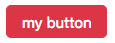
As you see, .btn described what element it will be, .red and .radius are modifiers, they described what this element will look like.
More button's usages:

  <button class="btn">Basic button</button>
  <button class="btn gray pill">Gray pills like button</button>
  <button class="btn big hollow red radius">Big hollow round button</button>
<button class="btn black small">Small black button</button>Zens UI has several containers, they are designed to quickly implement layout.
img-container:image containerflex-container:flex layout containerflex-row-container:flex layout container
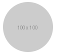
img-container's usage is like below:
<div class="img-container round" style="width: 100px; height: 100px;">
  <img src="https://via.placeholder.com/100x100" alt="">
</div>
It will be rendered like below:
In npm package, ZensUI.css is designed for common web developers, and ZensUI.mp.css is designed for weixin mini program developers
ZensUI/
    ├─ dist/
    │     └── css/
    │         ├─ZensUI.css
    │         ├─ZensUI.css.map
    │         ├─ZensUI.min.css
    │         ├─ZensUI.min.css.map
    │         ├─ZensUI.mp.css
    │         ├─ZensUI.mp.css.map
    │         ├─ZensUI.mp.min.css
    │         └─ZensUI.mp.min.css.map
    └─ scss/
       └─ZensUI.scss
Everything is MIT