Before I start this modal, I have used modal from react-native, react-native-modal, and react-native-modalbox. But none of these modals has all the features I needed, so I created this modal
I haven't release it on npm yet, you may install this modal by
npm install --save git+https://github.com/zhantx/react-native-flex-modal.git
| react-native-modalbox | react-native-flex-modal | react-native-modal | |
|---|---|---|---|
| Tap outside to close | yes | yes | not yet but close |
| Swipe To Close | yes | yes | no |
| Position | top, center, or bottom | anywhere | by changing style |
| Control | methods or jsx prop | methods or jsx prop | jsx prop |
| Where to use this component | has to be insisidede a full screen view (correct me if I'm wrong) | anywhere in jsx tree | anywhere in jsx tree |
| Animation | slide from top or bottom | slide in from any position along with fading and zooming | powered by react-native-animatable |
| Prop | Type | Default | Description |
|---|---|---|---|
| onCloes | func | Callback function, called modal is closed and animation is finished | |
| onOpen | func | Callback function, called modal is opened and animation is finished | |
| positionX | number | 0.5 | position of the modal, 0.5 means the modal is in horizontal center, 0 means the modal next to left edge of screen, 1 means the modal next to right edge of screen |
| positionY | number | 0.5 | position of the modal, 0.5 means the modal is in vertical center, 0 means the modal next to top edge of screen, 1 means the modal next to bottom edge of screen |
| backOpacity | number | 0.5 | Opacity of the underlay |
| timeIn | number | 300 | Timing for the modal open animation (in ms) |
| timeOut | number | null | Timing for the modal close animation (in ms), if it's null then it will use timeIn as default |
| fadeIn | bool | false | set to true when you want your modal fade in |
| fadeOut | bool | null | set to true when you want your modal fade out, if it's null then it will use fadeIn as default |
| scaleIn | number | 1 | scale of the modal in the beginning of open animation |
| scaleOut | number | 1 | scale of the modal in the end of close animation |
| positionXIn | number | 0 | horizontal offset in the beginning of open animation |
| positionXOut | number | null | horizontal offset in the end of close animation, if it's null then it will use positionXIn as default |
| positionYIn | number | 0 | vertical offset in the beginning of open animation |
| positionYOut | number | null | vertical offset in the end of close animation, if it's null then it will use positionYIn as default |
| tapToClose | bool | true | set to false if you don't want the modal to close when user tap outside the modal |
| backToClose | bool | true | set to false if you don't want the modal to close when user click back button(Android only) |
| swipeable | bool | false | make the modal swipeable(don't use scrollView in modal if it's swipeable) |
| swipeRangeX | array | [null,null] | horizontal range of the modal swipeable area,[-50,50] means the modal can only swipe 50 points to left or right, [0,0] means the modal can't be swipe horizontally, [null,null] means no limits horizontally |
| swipeRangeY | array | [null,null] | vertical range of the modal swipeable area,[-50,50] means the modal can only swipe 50 points to up or down, [0,0] means the modal can't be swipe vertically, [null,null] means no limits vertically |
| swipeThresholdX | array | [-50,50] | once the modal is dragged and released outside this threshold, the modal will close, [null,null] means no threshold horizontally |
| swipeThresholdY | array | [-50,50] | once the modal is dragged and released outside this threshold, the modal will close, [null,null] means no threshold vertically |
| inertia | bool | true | if the modal is closed by swiping, set to true will let modal keeps moving on that direction, false will let modal return to its designated position(positionXOut, positionYOut) |
| containerSytle | object | style apply to the container of modal, made this props cuz I need to imply elevtion on Android |
|
| isOpen | bool | Open/close the modal, optional, you can use the open/close methods instead |
I recommend use methods open() and close() to control this modal, this modal has tapToClose feature, when tapToClose is true, the modal will close when tapping outisde despite the the value of isOpen.
import React, { Component } from 'react';
import {
  AppRegistry,
  StyleSheet,
  Text,
  View,
  TouchableOpacity
} from 'react-native';
import Modal from 'react-native-flex-modal'

export default class Awesome extends Component {
  render() {
    return (
      <View style={styles.container}>
        <Text style={styles.welcome}>
          Welcome to React Native!
        </Text>
        <Text style={styles.instructions}>
          To get started, edit index.ios.js
        </Text>
        <Text style={styles.instructions}>
          Press Cmd+R to reload,{'\n'}
          Cmd+D or shake for dev menu
        </Text>
        <TouchableOpacity onPress={()=>this.modal.open()}>
            <Text>Open</Text>
            {/*
                This modal doesn't require to be inside a full screen view
                Can be anywhere in code
            */}
            <Modal
              ref={(modal)=>{this.modal=modal}}
              positionX={0.3}
              positionY={0.5}
              timeIn={500}
              fadeIn
              scaleIn={0.3}
              scaleOut={2}
              positionXIn={200}
              positionYIn={-200}
              positionYOut={200}
              swipeable
            >
              <View style={{ height: 100, width: 200, backgroundColor: 'white', alignItems: 'center', justifyContent: 'center' }}>
                <Text>
                  I am the modal
                </Text>
              </View>
            </Modal>
        </TouchableOpacity>
      </View>
    );
  }
}

const styles = StyleSheet.create({
  container: {
    flex: 1,
    justifyContent: 'center',
    alignItems: 'center',
    backgroundColor: '#F5FCFF',
  },
  welcome: {
    fontSize: 20,
    textAlign: 'center',
    margin: 10,
  },
  instructions: {
    textAlign: 'center',
    color: '#333333',
    marginBottom: 5,
  },
});

AppRegistry.registerComponent('Awesome', () => Awesome);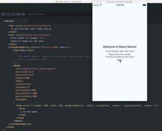
positionX is 0.3 so the modal is on the left, timeIn is 500 to slow down the animation, I didn't set timeOut it will be the same as timeIn. scaleIn is 0.3 the modal is scaling up from 0.3 to 1.
positionX and positionY are pretty handy if you wanna create a popover, you can set the position of modal based on button's position(use measure)