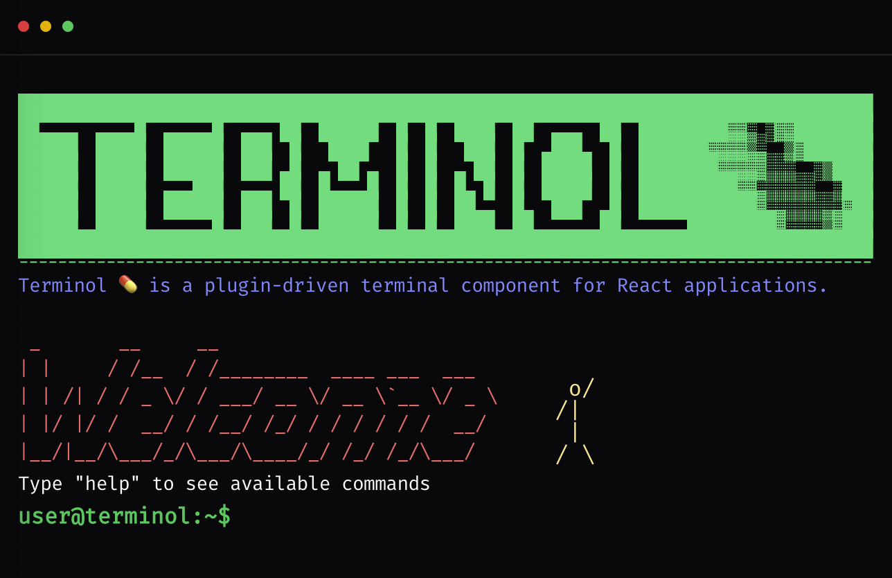
Terminol 💊 is a browser-based, plugin-driven terminal component for React applications. It is designed to feel like a real terminal while staying fully compatible with modern UI systems like shadcn/ui and Tailwind CSS.
I tried a lot of different names for this project, but every good one was already taken by some great project. Eventually I wanted something that feels like a "medicine" for terminal-style UX in the browser, so I moved from the idea of paracetamol to Terminol.
A small but important note: this project is not meant to compete with shadcn's own terminal example. We explicitly do not want Terminol to be confused with shadcn's terminal. In fact, Terminol uses the shadcn terminal component as its base building block.
Terminol started as a UX experiment for KODKAFA. The goal was to build an interaction model that is:
- strongly based on user interactions and intent,
- easy to observe and track how people use it,
- suitable for running small tools directly in the browser as commands.
Once the terminal concept was working well, the scope expanded: if we are building this for one project, it should be reusable for others. Today, Terminol is intended as a general-purpose, browser-based command surface that can host tools, wizards, and flows entirely as commands.
npx shadcn@latest add https://www.kodkafa.com/registry/terminol.jsonnpx shadcn@latest add https://www.kodkafa.com/registry/terminol/logo.json
npx shadcn@latest add https://www.kodkafa.com/registry/terminol/welcome.jsonTerminol focuses on a clear separation between core logic and UI rendering:
-
Core / State (Provider)
- Manages history, current input, output lines, prompt, interactive modes, and plugin execution.
- Exposes a
TerminolCommandContextto plugins with functions likeprint,execute,setInputHandler,openModal, etc.
-
Runtime (Registry & Parser)
CommandRegistryregisters and resolves plugins by name / alias.parseCommandturns raw input into{ command, args }.- History management is handled by a
HistoryManager, with optional persistence vialocalStorage.
-
UI Adapter
-
A presentational component (
TerminolAdapter) that:- renders output lines,
- keeps the prompt + input fixed at the bottom,
- scrolls only the output region inside the terminal box,
- shows modals and overlays as full-screen layers,
- wires keyboard controls (Enter, Arrow keys, Ctrl+Q, Esc).
-
-
Wrapper Component
<Terminol />wraps the provider and adapter for easy use in React applications.- Accepts configuration such as
plugins,init,theme,pluginProps, andstorageKey.
The core is intentionally headless and UI-agnostic; only the adapter knows about Tailwind classes and shadcn/ui.
-
Plugin Architecture Define commands as plugins with descriptions, aliases, tags, and optional interactive UI.
-
Theme-Aware UI No hardcoded colors. All styling comes from a theme palette and/or your Tailwind + shadcn/ui design system.
-
Light & Dark Ready Works with light/dark themes in the same spirit as shadcn's appearance model.
-
History Management Command history with Up/Down navigation, with optional persistence via
localStorage. -
Modals & Overlays Render React components as modals or full-screen overlays on top of the terminal.
-
Interactive Commands Commands can take over the input loop, ask additional questions, prompt for choices, and restore normal shell mode properly.
-
Input Interception API A clean
prompt()andsetInputHandler()API for building wizards, forms, and multi-step flows. -
Keyboard UX
- Ctrl+Q to abort interactive commands.
- Esc to close modals and overlays.
- (Optional) Tab for command completion (planned / experimental).
Minimal example in a page:
import { Terminol } from "@/components/ui/terminol/core/terminol";
import { TerminolPlugin } from "@/components/ui/terminol/core/types";
import { AnimatedSpan } from "@/components/ui/shadcn-io/terminal";

export default function TerminalPage() {

const WELCOME_ASCII = String.raw`
 _       __     __
| |     / /__  / /________  ____ ___  ___
| | /| / / _ \/ / ___/ __ \/ __ \`__ \/ _ \
| |/ |/ /  __/ / /__/ /_/ / / / / / /  __/
|__/|__/\___/_/\___/\____/_/ /_/ /_/\___/`;

const welcomePlugin: TerminolPlugin = {
  name: "welcome",
  description: "Show welcome message",
  action: ({ print }) => {
    print(
      <div className="space-y-1 mt-4">
        <AnimatedSpan delay={1000}>
          {WELCOME_ASCII}
        </AnimatedSpan>
      </div>
    );
  },
};

  return (
    <div className="h-[500px] w-full border rounded-md overflow-hidden">
      <Terminol
        prompt="user@dev:~$ "
        init={["welcome"]}
        plugins={[welcomePlugin]}
      />
    </div>
  );
}
The parent container controls the height. Terminol will:
- Fill the available height.
- Keep the input row fixed at the bottom.
- Scroll only the output area internally.
interface TerminolProps {
  plugins?: TerminolPlugin[];
  init?: string[]; // commands to run at startup (executed sequentially)
  prompt?: string;
  promptClassName?: string;
  className?: string;
  initialHistory?: string[];
  onCommandExecuted?: (command: string, ctx: TerminolCommandContext) => void;

  theme?: TerminolTheme;
  header?: React.ReactNode; // Custom header content (e.g. badges, links)

  // Plugin configuration
  pluginProps?: Record<string, unknown>;

  // Persistence
  storageKey?: string; // prefix for localStorage keys

  // Middlewares
  middlewares?: TerminolMiddleware[];
}
TerminolTheme is a set of semantic Tailwind class hooks. No hardcoded colors; you map them to your design tokens:
export interface TerminolTheme {
  container?: string;
  line?: string;
  prompt?: string;
  input?: string;
  cursor?: string;
  overlay?: string;
  modal?: string;
  success?: string;
  warning?: string;
  error?: string;
  info?: string;
  muted?: string;
  accent?: string;
}
Example:
const theme: TerminolTheme = {
  container: "bg-background text-foreground",
  line: "text-sm",
  prompt: "text-primary",
  input: "text-foreground",
  success: "text-emerald-400",
  warning: "text-amber-400",
  error: "text-red-500",
  info: "text-blue-400",
  muted: "text-muted-foreground",
};

<Terminol theme={theme} />;Plugins are the heart of Terminol. A plugin registers a command, its description, and an optional action and/or UI.
export interface TerminolPlugin {
  name: string;                       // command name (e.g., "greet")
  description: string;                // shown in help
  aliases?: string[];                 // alternative names (e.g., ["hi", "hello"])
  tags?: string[];                    // used for filtering (e.g., "code", "system")
  category?: TerminolPluginCategory;  // grouping for help (core, system, user, etc.)
  hidden?: boolean;                   // hide from help if true
  component?: React.ComponentType<unknown>; // UI component (advanced usage)
  action?: (ctx: TerminolCommandContext) => Promise<void> | void;
}

export type TerminolPluginCategory =
  | "core"
  | "system"
  | "user"
  | "demo"
| "content";When a command runs, it receives a context object:
export type TerminolCommandContext = {
  raw: string;                        // full input line
  command: string;                    // parsed command
  args: string[];                     // remaining args

  // Output & prompt
  print: (content: React.ReactNode) => void;
  clear: () => void;
  setPrompt: (prompt: string) => void;

  // Command execution
  execute: (command: string, options?: { silent?: boolean }) => Promise<void>; // run another command programmatically

  // UI
  openModal: (content: React.ReactNode, options?: ModalOptions) => void;
  closeModal: () => void;
  showOverlay: (content: React.ReactNode, options?: OverlayOptions) => void;
  hideOverlay: () => void;

  // Interactive input
  prompt: (options?: PromptOptions) => Promise<string>;
  setInputHandler: (
    handler: ((input: string) => Promise<boolean> | boolean) | null,
    options?: { prompt?: string },
  ) => void;
  abortInteractive: () => void;

  // Theming & config
  theme: TerminolTheme;
  props: Record<string, unknown>;
};

export type TerminolMiddleware = (
  command: string,
  ctx: TerminolCommandContext,
) => void | Promise<void>;import { TerminolPlugin } from "@/components/ui/terminol/core/types";
export const greetPlugin: TerminolPlugin = {
name: "greet",
description: "Greets the user",
aliases: ["hi"],
tags: ["demo"],
async action({ args, print, theme }) {
const name = args[0] ?? "Stranger";
print(
<div className={theme.success || "text-emerald-400"}>
Hello, <strong>{name}</strong>! Welcome to Terminol.
</div>,
);
},
};export const wizardPlugin: TerminolPlugin = {
name: "wizard",
description: "Starts a setup wizard",
tags: ["system"],
async action({ print, setInputHandler, setPrompt, theme }) {
const defaultPrompt = "user@term:~$ ";
print(
<div className={theme.info || "text-blue-400"}>
Welcome to the wizard! What is your name?
</div>,
);
setPrompt("wizard> ");
setInputHandler(
async (input) => {
const name = input.trim() || "Stranger";
print(
<div className={theme.success || "text-emerald-400"}>
Nice to meet you, {name}. Wizard completed.
</div>,
);
setPrompt(defaultPrompt);
setInputHandler(null);
return true; // indicates this input has been fully handled
},
{ prompt: "wizard> " },
);
},
};Terminol can use localStorage (behind a simple storageKey prefix) to persist:
- Command history
- Plugin-related state (for example cookie consent) if you choose to store it
You can configure the storage key prefix via:
<Terminol storageKey="terminol-demo" />The internal implementation uses small helpers like:
loadFromStorage(key)saveToStorage(key, value)
You can replace or wrap this logic if you need a custom storage backend.
- Enter – execute command or send input to the active interactive handler.
- Arrow Up / Arrow Down – navigate history (when not in custom input mode).
- Ctrl+Q – abort interactive mode, clear the current input handler, and restore the default prompt.
- Esc – close modals and overlays.
- Tab – optional, planned: command completion using the plugin registry.
Terminol is designed to be embedded into your app as a git submodule, so you can:
- Develop the plugin in-place under your app's tree.
- Share the same Terminol repo across multiple projects.
- Avoid copying code into multiple repositories.
From your app repository root:
git submodule add [email protected]:kodkafa/terminol.git src/components/ui/terminolThen commit the submodule definition:
git add .gitmodules src/components/ui/terminol
git commit -m "Add Terminol as git submodule"
git push origin main
Your app now contains:
.gitmodules– submodule configuration.src/components/ui/terminol– a checkout of the Terminol repo.
When cloning the app on a new machine or CI:
git clone [email protected]:kodkafa/terminol.git
cd YOUR_APP

git submodule update --init --recursive
Or in one step:
git clone --recurse-submodules [email protected]:kodkafa/terminol.gitThis makes sure src/components/ui/terminol is checked out at the commit referenced by your app.
You can work on the plugin directly under src/components/ui/terminol, but commits belong to the Terminol repo, not the app repo.
- Enter the submodule:
cd src/components/ui/terminol- Make changes and commit them in the Terminol repo:
git status
# edit files...

git add .
git commit -m "Improve interactive cookies flow"
git push origin main- Go back to your app repo and commit the updated submodule pointer:
cd ../../..
# back at app root

git status
# shows: modified: src/components/ui/terminol (new commits)

git add src/components/ui/terminol
git commit -m "Bump Terminol submodule to latest"
git push origin main
Now:
- The Terminol repo has the new code.
- Your app repo points to the new Terminol commit.
When Terminol has new commits (from you or others), update your app's submodule reference:
cd src/components/ui/terminol

git fetch origin
git checkout main
git pull origin main

cd ../../..

git add src/components/ui/terminol
git commit -m "Update Terminol submodule"
git push origin main
This moves your app to the latest Terminol commit on main.
After pulling in the app repo:
git pull
git submodule update --init --recursive
CI builds should also run:
git submodule update --init --recursiveso that the correct version of Terminol is always checked out before building or testing.
Specify the license you want to use, for example MIT:
MIT License – see LICENSE file for details.