-
Notifications
You must be signed in to change notification settings - Fork 345
Full flex popup #186
New issue
Have a question about this project? Sign up for a free GitHub account to open an issue and contact its maintainers and the community.
By clicking “Sign up for GitHub”, you agree to our terms of service and privacy statement. We’ll occasionally send you account related emails.
Already on GitHub? Sign in to your account
Full flex popup #186
Conversation
|
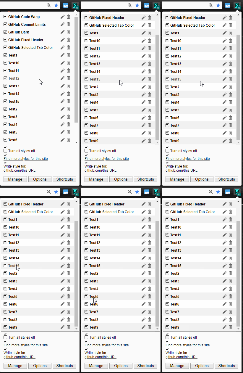
You probably should have based this off of the freestyler branch (#158) since it'll have conflicts there. Also, when I add a bunch of styles, the checkmarks extend outside of the container and don't appear to scroll properly. This isn't an issue with the current popup. Lastly, the hover color is off. Hovering over an active style should make the color more black, not more gray. And on disabled styles, hovering over the text shouldn't make it the same color as an enabled style. It's confusing. |
|
Also, would we still need the "Popup width (in pixels)" option? |
This is more about converting to a complete flex layout in general. The details are stuff I thought could use improving while I was at it. AFAIK, we still haven't decided on the "find styles" option, but anything could easily be incorporated. Personally, I hate both of their icons, and would rather not have to look at them.
Should be fixed.
This seems like the right idea till you see it. Grey that's light enough to be obvious when turned black on hover looks too light as default text coloring.
It's the opposite colors of the regular hover because the action is opposite. I also removed colorization and transitions for them, because the opacity is already achieving the same effect, and they look glitchy on top of each other. It has no checkmark and less than half opacity till hovered. How is that confusing? |
|
Ok, that works better.
Hmm, maybe it's because I am not liking the animation delay... Otherwise it LGTM. |
|
Looks good, but just like @Mottie, I really don't like that hovering over an applied style makes it appear inactive and vice versa. I would use an underline or no transition at all. |
|
|
Correction: the current hover effect may work as is if limited only to the checkbox because it'll indicate what happens more obviously. |
|
And I think we should release what we have ASAP because it'll fix the issues with dysfunctional indexeddb in FF/Vivaldi/Chromium. Then we can polish the popup, integrate the compact layout, freestyler and usercss support. All languages that get translated in a timely fashion, except Japanese, are 100% ready so if @schomery agrees, I say we release right away. |
|
Everything looks good to me on the master branch. Let's update to "v1.1.4" and release. |
|
@schomery, the Japanese translation was updated too. Maybe you can resubmit as 1.1.4.1? |
|
I am updating Firefox and Opera to v1.1.4.1. Chrome version was rejected as usual so I am still waiting for a response from the support team. I'll deal with the Chrome submission later! |
|
Can we do something so that it's not rejected automatically? |
|
I am asking this every single time from the support team, but we always get automated responses! |
I think I converted them all.
It's odd to me that we're using 2 instead of 4 everywhere, but especially in the html, since the structure guide lines would be more useful. Maybe I could tweak them when I get around to setting my editor to use spaces instead of tabs. Anyway, I fixed the couple I saw. Always possible I'm blind and/or dense.
Showoff. =) Looking at the js, methods to achieve objectives get convoluted in my head, but of course yours makes much more sense. I was kinda proud of myself that I got it to work, but I figured the code was for shit. I think I've switched it correctly.
Fair enough. It's not like I loved the text hover, but I do think it's important to indicate the click area/action in an obvious way. I implemented the custom checkboxes to use as the subtle "action" indicator, but if we make it a little less subtle, it also serves pretty well as the "click area". I cut the transition in half, which I think is good, but they're a little abrupt with none at all IMO. I also switched disabled and not-applied checkboxes to use the same transition as the opacity, which looks the best to me. They didn't have the Personally, as soon as left-click edit is implemented, I'll never use the checkbox/toggle UI again. Still, I think the checkbox states as click indicators is a huge improvement. If you guys want to tweak the hover states, please be specific. The current styling LGTM though. Like I said, the intention here was mostly to recreate a completely flex version of the classic layout, which will simplify UI switching. The other stuff was either changed directly to facilitate that, or little details like the checkboxes and disabled states. Obviously, I plan to use this as the basis for the layout switching, which will be easier to work on once the "add class" options are implemented. The code is gonna get a lot sloppier before it gets cleaned up again, but I think it's decent now. I'm eyeballing it though, not running it through a beautifier, so beauty is in the eye of the beholder. Anyway, if you guys are happy with the checkbox and disabled state changes now, they are the only real noticeable changes, but I think they're a real improvement. If the code is good, I think we should get it out there so it can be associated with the "classic layout" before we implement switching. |
|
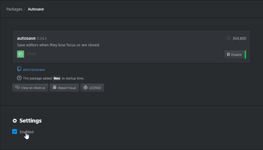
@Mottie You use Atom, right? Any idea how to force a traditional save/discard prompt for all open edited files on exit? I've been trying out different editors, and I'm really liking Atom, but I'm not finding any way to accomplish this. At least half the editors have this as the default behavior, but they all at least have an option for it. I have it set to start with an empty editor, so why the hell would I want it to save edits internally on exit?Maybe I'm missing something simple, but Google hasn't been much help. |
|
Actually I use Atom on and off... it has a few issues that make it very annoying:
I'm sure there are more problems I forgot to mention. Make sure to check out VSC, I'm starting to like it a lot more. |
|
Yeah, I'm not looking for autosave. I simply want to enable a traditional save/discard prompt for all edited files in open tabs. I realize most editors wanna at least offer "save edited project states internally" as an option, and some by default, but this is the only one that seems to have no traditional prompt option. That's a real shame, because that's a deal-breaker IMO, but I love the fact that it's built on Chrome and the UI is so customizable. I got a a toolbar button plugin up and running pretty painlessly, which was nice. It seems to be decent at saving "project" states internally, but I don't fully trust it, and if I have it set to open empty, I have to go hunting and then get weird prompts to discard or keep changes that I don't even recall. I'm not some serious coder who needs all the Github integration or to edit gigantic files. I'd rather the sidebar was a simple explorer-like navigator, and disable "projects" altogether. Seems like they're trying really hard to implement all the sophisticated features and none are quite perfected, while at the same time, completely neglecting simple options to disable all the complicated and still buggy features, so it can be used as a simple code editor. Even Sublime, which they're trying to emulate, has a couple JSON entries to make it so, which are easily googlable: When you google the same for Atom, there are just a bunch of unresolved issues, mostly about bugs with the stupid internal project save functionality. Every editor should have the ability to be a simple, traditional editor, without all the bells and whistles. I'm not having any luck accomplishing this with Atom, unfortunately. I was really hoping to though, because I really like how simple the UI style/functionality is to manipulate. I tried VSC briefly. Like I said, it's really more than I need. The UI style/functionality is nowhere near as customizable, which is important to me. |
|
Are the hovers good? In case my posts were TL;DR, I need some js magic to keep going on this. Basically, switching the "popup order" option to an addClass. Two should suffice, one for "all actions on top" in the classic layout, and another for "icons to the bottom" in the icon layout since they'll be on top by default. A couple new options are needed as well. One to switch the style-name click action, which should also add a class so the layout can be adjusted, and another for the UI switch, which could add '.classic' since that'll be the optional layout. The other couple details are that the toggle functions for style-name and global disable could be reworked so they're not so checkbox oriented, since checkboxes will be mostly indicators and a clickable parent will be simpler to manipulate. This all seems like the best way to go about it in my head, but let me know if you don't agree for whatever reason. |
|
Not a lot of context there. Was this meant to add the ability to key on [stylus-iframe] in the UI? |
|
No, it means the popup will list styles from iframes, the badge will also count styles in iframes, the write-new-style will also allow writing styles for iframe URLs. |
|
Oh, duh. I've always been a big fan of implementing that. Shouldn't have any conflicts with the layout options in general though. My thought has always been that we should group globals and iframe styles as a single expandable entry at the bottom of |
|
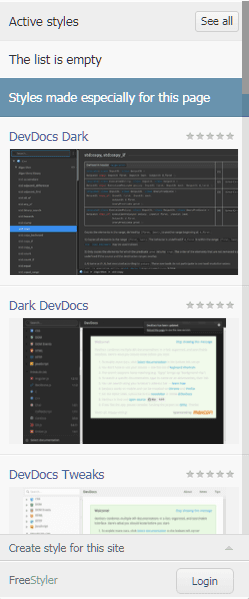
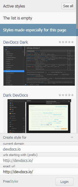
I assume "see all" is sorta like the expandable entry for globals and iframes concept, except I think it should be at the bottom, with regular site styles having their own entries on top as always. I absolutely despise the bloated image bullshit in the popup though. This is what Stylish did as well. If you look at the choices they made for the UI and the website itself, it's easy to see why there were conspiracy theories about the two being connected somehow. I've always figured the most useful of these iframe features is detecting and displaying styles active in iframes for troubleshooting purposes. 'write-new-style` for iframes might get pretty tricky, no? Real handy for users who don't fully grasp the concept, I guess, but some sites are a mess with iframes inside of iframes. There are a lot of nightmare scenarios out there. As far as the badge registering iframes, I'm not sure how useful that'd be. |
|
We've actually discussed the idea of exempting globals from changing the icon to active before, which I think is a solid idea. The only time mine is ever inactive is on internal pages, which kinda defeats the purpose. If that were the case, I could see icon changes for active iframe styles, when there are no active site styles, being useful. Otherwise, I'm not sure if them registering in the badge count is necessarily warranted, although a count in the expandable entry might be cool. |
|
I think you've mentioned the case when someone has a style for e.g. disqus or youtube embedded video iframes while the main site doesn't have any styles. I'm not sure which icon Stylus should use here and whether the badge should show anything. We can add an option to show iframe styles after It's pretty straightforward to count iframe styles whenever a new iframe asks for applicable styles. However, the problem is how to detect a removed iframe. The only way, AFAIK, is to monitor each page and all of its embedded iframes in a MutationObserver, which is an overkill, especially since it's not needed to add the styles (which is why we ditched MutationObserver recently). I guess then the badge and icon won't reflect iframe styling. |
|
Ugh. I'm just lazy. |
|
Deferred to #517. |

No description provided.